You have a hose, you want water to go in one end and come out the other. But then you put six holes in it for a laugh. That is what you are doing if you have landing page navigation
If you are running a google ads campaign you should absolutely be using landing pages. As opposed to sending people to your main website. And one of the big differences between a landing page and a normal page is that your landing page shouldn’t have navigation.
There will be certain types of campaign where this isn’t possible such as ecommerce campaigns. But for most service based marketing campaigns – landing pages are applicable, and will lead to a big increase in the amount of business you are getting.
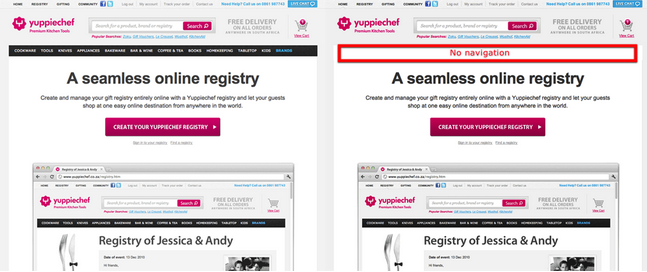
Over on VMO they documented a split test where half the traffic was sent to the normal website but with the landing page navigation removed. The other half was sent to the original page:

source: httpss://vwo.com/blog/a-b-testing-case-study-navigation-menu/
The Results of Removing Landing Page Navigation
Removing the navigation led to a 100% increase in the number of conversions they received! They doubled their business opportunities.
And this is just one of the changes you would make in the process of setting up landing pages. So if you aren’t using landing pages there is a good chance you are getting half as much business as you could be, and paying twice as much per enquiry.
How Can This Be?

There are three reasons why removing your landing page navigation will help.
Reason 1:
The easiest to explain: if the visitor lands on the right page then any other page on your site is less likely to convert them. By keeping them on the right page they are more likely to convert. Any other info they need that might help them convert should be on this page too so they don’t have to navigate around the site.
Analogy 1: You come to my office, I am giving you a sales pitch, and then half way through the pitch I ask if you can leave and go up to the third floor where I have some documents to show you the benefits of my service. Then I ask you to go down to the second floor so I can show you some testimonials. Then the 4th floor so I can show info about the history of my company. You would think to yourself “why didn’t this guy just have it all in one place to start with”.

Reason 2:
Any possible actions other than “reading the page” and “signing up” are going to lead to distraction. You only want people to read the copy and then call or fill in the form. Giving people more options leads to less people progressing down the path you want.
In conversion copywriting people often say that each element should have a single goal. The goal of the headline should be to get them to read the first paragraph. The first paragraph should get them to read the second. And so on until the get the “call to action” that recommends they contact you.
Analogy 2: I have a hose, I want water to go in one end and come out the other. But then I put six holes in it for a laugh.

Reason 3:
The first copy someone sees when they land on your page has the biggest impact and frames the rest of the page. In psychology this is called the Primacy Effect. Your navigation is definitely not compelling copy. No body will see the words “home, about us, services..” and think “This service sounds great”.
Analogy 3: I walk up to an accountant and say “I need an accountant can you help?”. And she replies “Home, about us, services, login, newsletter, latest twitter posts, 0800 371..”.
