When it comes to Google Ads, there are many more factors in play than just your ad copy, keywords, or anything else that appears in the editor. It’s good to have an ad that gets clicks, but what happens after that click is just as important. Where has the person who has just clicked on your ad – and cost you money – gone to? This is where PPC landing page design is crucial.
Many PPC agencies like us offer landing pages as a service – which might surprise some people, as Google Ads isn’t a particularly visual medium. But considering how tightly married these pages are with ads, they’re just as important to ensuring good results on a campaign as technical factors of PPC management are.
But why should you make your landing page design a priority?
Why You Need Good Landing Pages
First impressions are everything in digital marketing. Think of PPC ads as a doorman: they can encourage people to come in, but, ultimately, their job ends at the door. After that, it’s up to you and your site to sell them on converting properly. The page where people who click on your ads end up is called the ‘landing page’, and it’s such a crucial element of campaigns that even Google has started to separate them out in their own Google Ads tracking tab.
There’s a few reasons why this is the case specifically for businesses:
- A good landing page will save – and earn – you money. This is the long and short of it. Having an effective landing page means that you generate more conversions from initial clicks – people who click but don’t convert cost you money!
- A good landing page builds your brand image. Google Ads are, at their core, just copy. It’s hard for people to get a feel for your brand based off that alone. You can encapsulate your identity neatly in a good landing page.
- A good landing page keeps your marketing consistent. It’s easy to get tonal whiplash from PPC ads written by an agency to a home page written by your developer. Having a unique landing page allows you to target your messaging and align your message with your ads.
There’s many more reasons, but we don’t need to go on about aesthetics or flare. The bottom line is that landing pages get you better results, and we say that as a voice of experience.
Over 15 years, we’ve been running PPC campaigns for our clients – as part of our optimisations, landing pages are usually one of the first things we recommend after or even before initial set up.
This isn’t a black mark on any client’s websites: but they’re often written with an eye for web design and sleek imagery rather than conversion rate optimisation, which is our speciality.
So what are a few examples of landing pages we’ve written for clients?
PPC Landing Page Design: Case Studies
Here’s some clients we’ve done or been involved in the landing page work of:

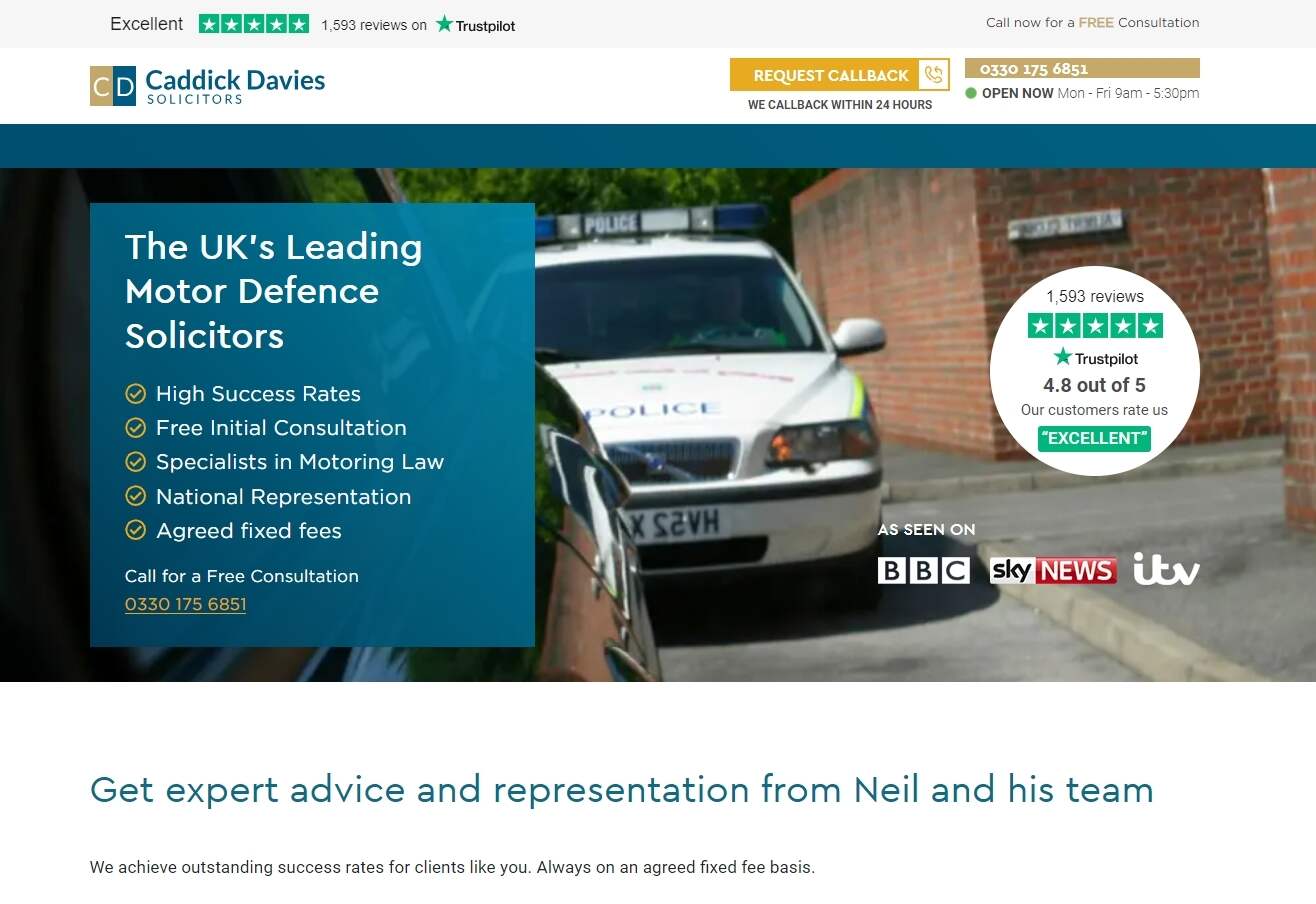
Here’s an example of a landing page a legal client uses. You can immediately notice the most important thing for a good landing page – efficiency. They’ve made tight use of the top of the page to succinctly stake the unique selling points of their firm, provide a phone number for consultations, then build credibility with reviews and features.
Page real estate management is really important to good landing page design. Many people rarely scroll beyond the first few lines, so you need to make sure that your top of the page is putting across a firm representation of your offer and establishing your credibility quickly.
This is also a rare efficient use of a banner – many people like to use banners for video montages or prominent images, but these just take up a massive portion of that page real estate without establishing any real meaning. When it comes to PPC ads, being relevant is more important than being visually appealing.
If you take one lesson from this ad, it should be that: from these new pages, the client is incrementally improving month on month in split tests against their old one, and that’s just with a few minor tweaks to the copy in the list. Once you land on a design that’s focused on selling why people should contact you, your life becomes much simpler – just optimise that!

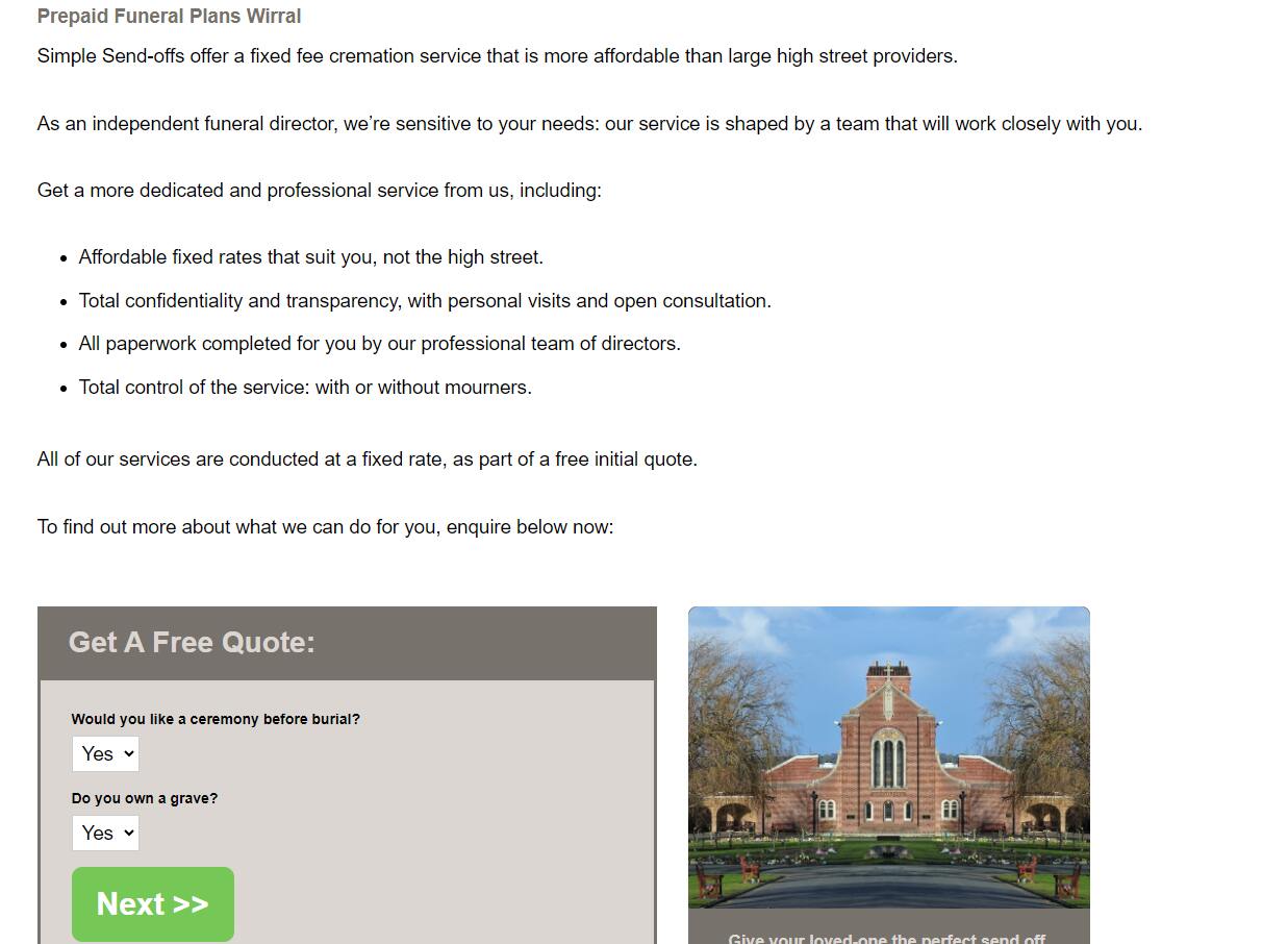
To further elaborate on the point that you don’t need to be visually striking to be successful, here’s a landing page we made for a funeral home client offering instant cremations. You can see this is a very barebones design, with succinct text that occupies a sentence a line and no bulky paragraphs.
Along with page space management, it’s important to bear in mind how the copy you’re writing will come across. If a new reader sees a giant paragraph, they’re going to immediately shut down and not engage with it, no matter how compelling the content. Through keeping things simple and basic and avoiding unnecessary fluff, this page is friendly and a quick read for someone interested in the service.
That matters – though they’re a small campaign, these guys have been getting up to eight calls regularly a month off this page, more than justifying the cost of their PPC campaign.
An intelligent quirk of this page is the two part form utilised alongside the copy – meaning that even after someone hits ‘next’, they’re simply taken to yet another landing page with more benefits and aspects of the service listed.
This, in addition to the form being so prominent against the rest of the page, encourages a quick and engaged conversion as much as the ‘Get a free quote’ call to action.

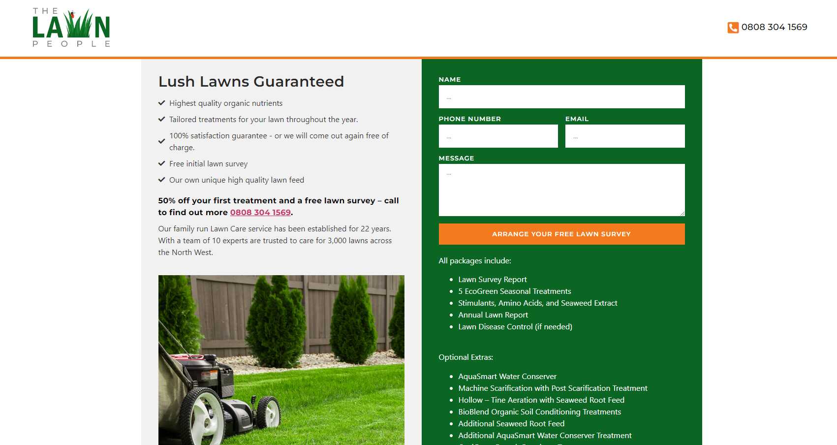
This last case study is a good example of how to place further detail on a landing page. When creating this, we made sure to include a guarantee prominently and make it the unique selling point of the business we chose to highlight, with an offer and the number is an emboldened call to action.
Beneath the contact form itself, you can also see we’ve listed further benefits of the business, with a comprehensive list of what is included in their packages and optional extras. By establishing value and then elaborating on the offer, we give the reader the opportunity to internalise that the offer is good value for money before explaining how it helps them further.
Again, with this page, less is always more with copy. If you can summarise the benefits of your business in a neat bullet point list, you’re already halfway to a great landing page.
Technical Tips For Good Landing Pages
In all of the above case studies, there’s probably something you noticed – or maybe you didn’t. The lack of a navigation bar. These are prominent across every single site in the modern day, and they’re usually a great convenience tool for helping to highlight specific pages and content for curious users.
However, when it comes to a landing page, a navigation bar can be a fatal mistake. If navigation is included, two things happen:
- You lose out on valuable web page real estate.
- You redirect your visitors to pages that aren’t conversion rate optimised.
This is both a design failure and a practical one. Wherever possible, you should kill the navigation bar from your landing pages. It just makes things much easier and allows the copy on the landing page itself time to breathe.
Google Ads isn’t the sort of place you want to encourage bounce rates and traffic-focused campaigns: remember, it’s pay per click! Every click costs you money.
Outside of that, remember the key tenets of landing page design:
- Less is more. No elaborate paragraphs, fluffy language or bulky read-outs: be simple, clear and concise. You’re trying to sell, not educate!
- Lists, lists, lists. Know of a few benefits of your business over competitors? More than one USP? Put them in bullet points and have at it!
- Manage your space. Remember: the top of the page is where everyone’s eyes are guaranteed to end up. Even if nobody scrolls down, they will see there. If it’s important, it should go there.
Complimentary PPC Landing Page Design Service
Now you know some of the factors – technical and otherwise – that inform our landing page design approach. Hopefully this will help you design your own pages, or give you some pointers for those who do.
Did you know that Measured Marketing offers landing page design services complimentary with our PPC campaigns to all our customers? Check us out here if you’re interested!

